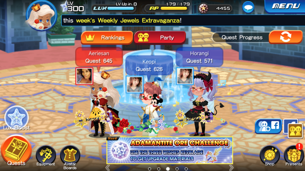
“…I feel there are too many ways/buttons to get to the same place.”
Kingdom Hearts Union Cross is a Kingdom Hearts game exclusive to the iOS and Android smartphone platforms. Gameplay involves players navigating a customized avatar through Disney-inspired worlds fighting enemies, along with taking down bosses in multiplayer matches in competition with other teams.
For experience in working more with Game UI, I decided to challenge myself to recreating the UI for a more pleasurable User Experience with the game overall.

User Research
Several Kingdom Hearts Union Cross players have been interviewed on their experience with this game ranging from Newbies to Veterans. Most of the interviewees are Casual Union Cross players, about a third of the players are Hardcore players (playing for several hours every day) and extremely loyal to the Kingdom Hearts series.
Game UI Design
From the user interviews of the various players and UX research of the Kingdom Hearts Union Cross platform, I’ve created several drafts and prototypes for a more seamless and easier navigation for the Union Cross game for both Veteran and Newbie players. Creating certain groupings for the many options were a big help in making this come to fruition.
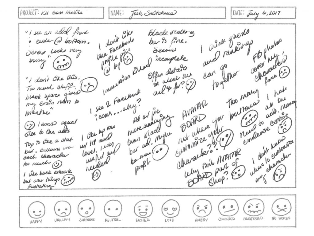
I’ve interviewed 5 people on their opinions on the current UI of the Kingdom Hearts Cross mobile game. About half are veteran players (playing the game since the initial release), the other half are completely new to the game. Both gave interesting perspectives on the matter. Josh Smitchens is a newbie to the game. I recorded his experience with it with Sketch notes and created an Experience Map with the data received.

Overall Josh was completely overwhelmed and couldn’t complete some of the most basic scenarios for the game such as customizing the avatar and finding certain game Quests. After several user interviews and heavy research into the game UI, the general consensus was that navigation through Union Cross was confusing, several buttons and items seemed repeated and many options on the home screen were either rarely used or distracting.
“…From the get go, on the home screen, I feel there are too many ways/buttons to get to the same place.“
–Raquel Gonzales, Veteran player
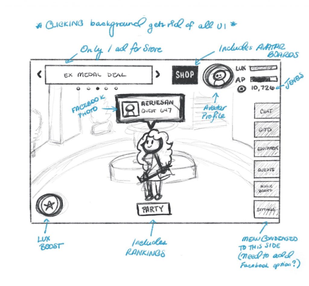
For my first sketches, I focused on creating more organization for the buttons. Items pertaining to game stats such as LUX, AP and Jewels were condensed and put together in the top right corner. Quests and equipment were grouped to the right with Chat and Gifts. The Notice Board was also added to the Home Screen since most users claimed they look at this quite frequently and hate having to search through Settings to find it.
In addition, the scrolling black bar was removed to create one area (instead of the previous 2) for Shop ads and Event Notifications combined. The character bubble that floats above the avatar’s head now includes their Facebook photo (instead of hanging outside of it). The button to switch between showing Quest Progress, Weekly Lux, and Total Power in the Avatar bubble has been removed and would instead cycle by tapping the bubble itself.

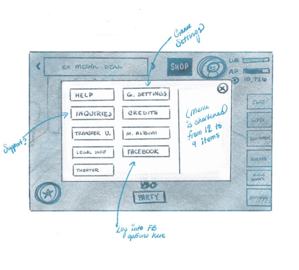
Due to several items on the Home Screen being repeated on the Menu, I decided to remove some of these options to make for a cleaner menu as well. The Facebook button/options that originally lived on the Home screen now stays here since user research showed this option was barely used and therefore, might not need to have permanent residence on the Home screen UI.

