Army Libraries ( Digital Rebranding )
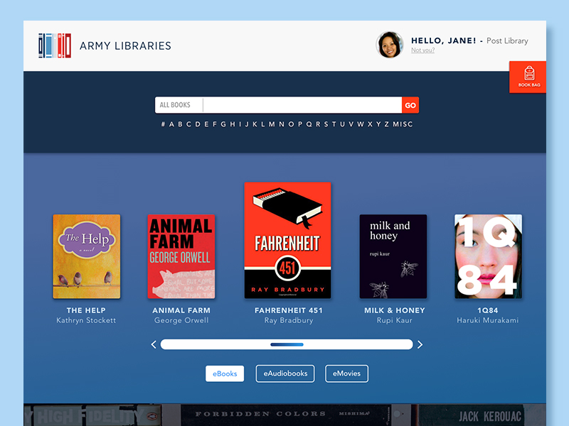
Army MWR Libraries have various post Libraries in Army garrisons all around the world. To keep up with the current modern advancements in books and tablet reading, Army Libraries needed a new logo along with a redesigned website to turn over a new leaf. I designed a logo as a hybrid of a classic paperback book along with a digital barcode.

Logo/Brand ReDesign
Since Army Libraries want to move towards a more digital and mainstream type of service for its members, it is important for the logo to show this transition from traditional to modern.
UI Design
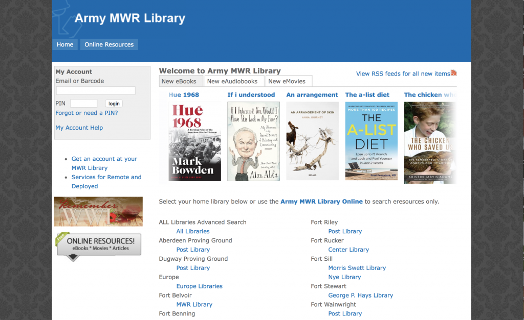
The previous Army Libraries website had been a bit outdated and hard to navigate, especially for it’s older audience. It was extremely important to make the new UI design easier to navigate and way more intuitive.
From researching the current Army Libraries website, there seemed to be some areas where certain actions could be combined or erased from the page overall. Common suggestions from a few users suggested that not many people were aware of the options to change the Featured books to Featured eAudiobooks and eMovies. The front page also wasn’t as friendly as it could be since most new visitors are unable to do anything unless they already have a MWR Library account already set up.
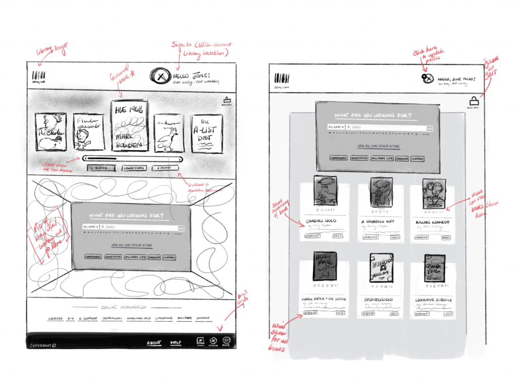
While sketching wireframes, I felt it was important to give more breathing room to the content by adding more white space and better hierarchy in terms of the logo, profile, featured books, etc. I wanted the tabs for the books, audiobooks, and movies to be a bit more prominent and the featured items easier to scroll through. It was also important to have a search bar immediately on the home page for users who are logged in and those who aren’t logged in yet.
It was also important to add some sort of Book bag or cart since this had been missing from the site previously. Users can navigate through their items a bit easier and fix accidental button pushes creating a stress-free visit to the website.
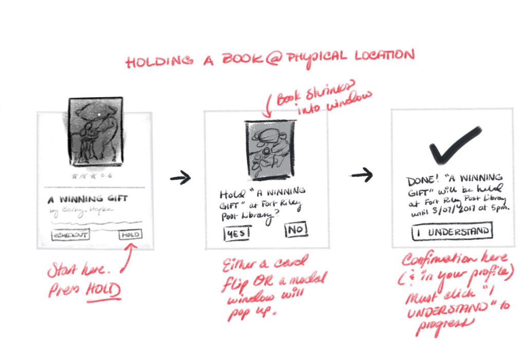
Regarding holding and checking out specifically, Army Libraries would provide 2 options: a physical checkout at your local garrison library and/or a e-checkout by reading the book on a phone/computer/tablet. A physical “hold” check out would work even faster since the user would have to specify their home Library when creating an account (thus getting rid of the option to have to choose specific libraries every time you check out a new book).
In the final UI design, the search bar was removed from below the featured items to above since most users claimed this would be the most important content piece of the website and would like easier access to it.
When searching for books, they each have their own cards where the user can dictate if they want more information on that book, see what other fellow readers rate that book out of 5 stars, and/or decide to check out that book.
To check out the current interactive prototype, check out this link
